PRO—VITAL 09
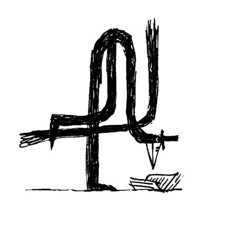
Reading Bird
The Reading Bird character initially was created to support the promotional campaign of Children's Russian library in Zurich. There was no identity though, just the name, thus the mascot seemed preliminary. We had to get back and develop the identity from scratch.
The idea was to make the identity instantly recognisable and keep the initial character as it gained the appreciation of the client already.
![]()
![]()
![]()
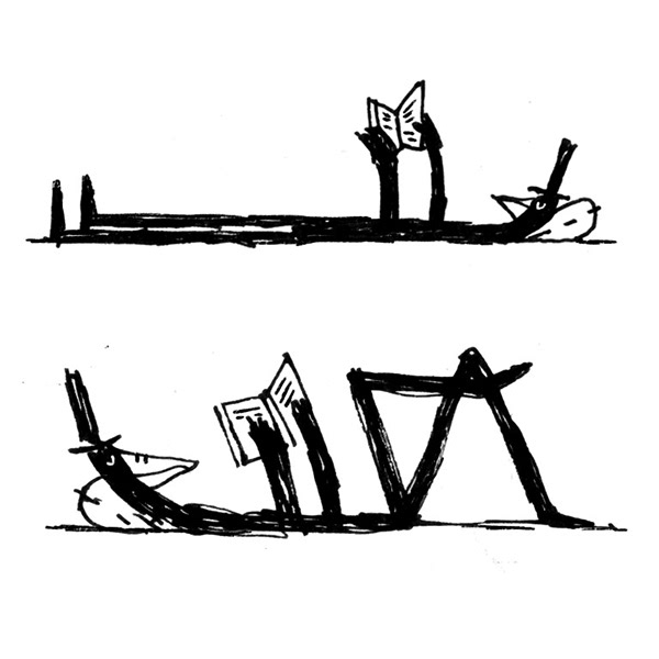
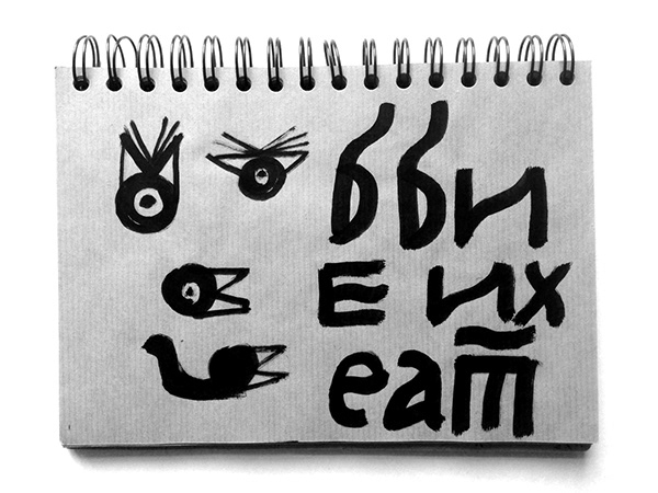
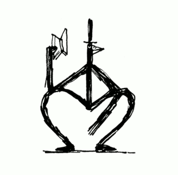
![]() Children’s Russian library in Zurich identity, work in progress, sketchbook
Children’s Russian library in Zurich identity, work in progress, sketchbook
The idea was to make the identity instantly recognisable and keep the initial character as it gained the appreciation of the client already.


The library planned to be an open source, sharing and exchanging the books written in Russian primarily for kids and teens. The top hat must go, at least for the identity part. A baseball cap and a skateboard seemed more appropriate for kids.
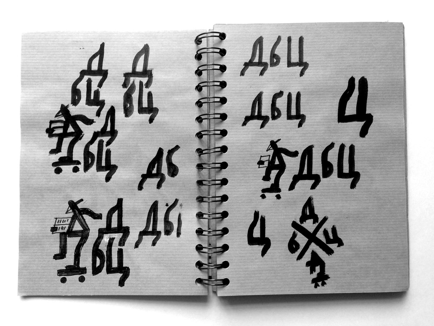
The lettering was tricky, as it needed to be visually linked to the bird. The same logic must be applied here. The process of research included, of course, the range of beautifully designed Soviet logos and visual history of cyrillic lettering. Special thanks goes to the type designer Elena Novoselova, her sharp eye and attention to kerning were the most valuable help here.
The lettering was tricky, as it needed to be visually linked to the bird. The same logic must be applied here. The process of research included, of course, the range of beautifully designed Soviet logos and visual history of cyrillic lettering. Special thanks goes to the type designer Elena Novoselova, her sharp eye and attention to kerning were the most valuable help here.

Children’s Russian library in Zurich identity
The Reading Bird, sticker pack to promote the library in social media
While the significant part of it is still in progress, the logo is ready to be applied and there’s a set of Telegram stickers to promote the library. You can download them here.
Top hat stayed there fortunately for all of us. And who said the fashion won’t change..?
Top hat stayed there fortunately for all of us. And who said the fashion won’t change..?